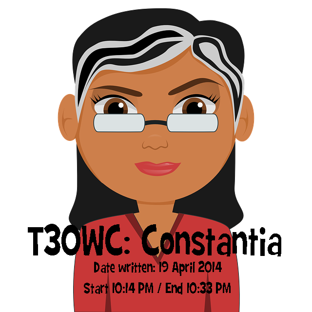
I am in search for my new, favorite font. I found her and her name is: Constantia.
For a while I was enamored by Cambria, taking inspiration from its pleasant strokes and serifs that makes it easier for me to finish reports and articles.
I am done with Times New Roman and Arial. They are too clean and reminds me of book reports and reaction papers I was forced to submit while in school.
Since 2012, I embraced Kristen ITC with arms wide open because she makes me think about smiling children, thick storybooks and colorful butterflies. I seek her help every time I work on child-related materials.
Dear Trebuchet MS became an on-and-off lover between 2003 to 2007 while I was a college student. My love for him was due to two distinct reasons: (1) it made my paper looked creative but business-like because of the curved tail of the lowercase “l”; and (2) the dots of “i” and “j” are just different that seems to warrant attention from the document’s reader. I attributed my academic success in college to him. But because my feelings for him were too detailed, I found myself always bored and restless. So I ventured into other sans-serif typefaces hoping that they will be able to offer a better alternative.
Then came Tahoma and Verdana.
I don’t know exactly why Tahoma became a friend but I remember him being my constant companion in writing and rewriting news articles for Journalism classes. Verdana was an optical experience because she is still readable even when the font size is only 8 or 9.
I met Palatino Linotype after graduation while working as a cub reporter for a local newspaper. I was given a desk with a computer that ran as slow as a turtle so often times, I busied myself with writing news leads that I myself don’t understand. To appear busy when an editor passes by infront of me, I “worked” on changing the typefaces. Palatino Linotype suddenly graced my screen and somehow reminded me of Courier New, the typeface I associated with my neighbor’s retired typewriter.
I have been living with Calibri and Cambria for three years now. They’re okay. Not boring but not exciting either.
Tonight, to spice up my boring writing life, I am in the quest for my new, favorite font or typeface because I need to write and write some more.
I don’t know about other people but to me, a font is a writer’s front row soldier. Fonts (or typefaces) help me write. They push me to write. They make me want to write because I am excited to see 10, 20, 30 pages of text using that favorite font. Then, I will convert that Word document to a PDF file so the font won’t change when I email that document to a friend, a writer-critic, an editor, or to myself.
It is VERY important for me to connect with a font so I can write.
I haven’t found him or her tonight.
So…for the time being, I am seeking refuge in the comfort of Constantia, whom I have met in a chance encounter as I was checking out the playfulness of Comic Sans.
She – Constantia, that is – seemed to be alright.
At least for the night.
***
T30WC or The 30-minute Writing Challenge is a writing exercise born out of this blogger’s need to maintain a habit of writing. Subjects of each writing challenge is just about anything but should ONLY be written within 30 minutes.


